The Studio team, the business unit managing all brand assets at Jow, asked me to lead the revamp of the full icon set with the help of one of their designers.
The icon set needed to be redone to bring consistency to the brand
Since Jow rebranding, their icon set didn’t evolve much. Over time, it became inconsistent in term of brand alignment as well as within the icons themselves.
It was time to take a step back, to better understand why, where and how these icons where being used.
About the state of things
Before jumping in the making, it was important to understand how icons were being used across the app and the website. Which sizes were the most relevant? Do they need to be outlined or filled? Which ones were not used anymore?
The team and I started by drawing a comprehensive presentation for the stakeholders to be informed of our findings and suggestions.
We decided that we would make a differentiation between UI icons, used everywhere in the app for contextual actions, and illustrative icons which were useful to add bits of branding.
The focus would be on UI icons as they were more important for the time being.
Bringing some clarity
We aimed to keep a canvas of 24px for the majority of UI controls, leaving 16px in use only when absolutely necessary.
We chose to also use a 2px stroke to ensure bold icons that stay sharp and impactful across devices.
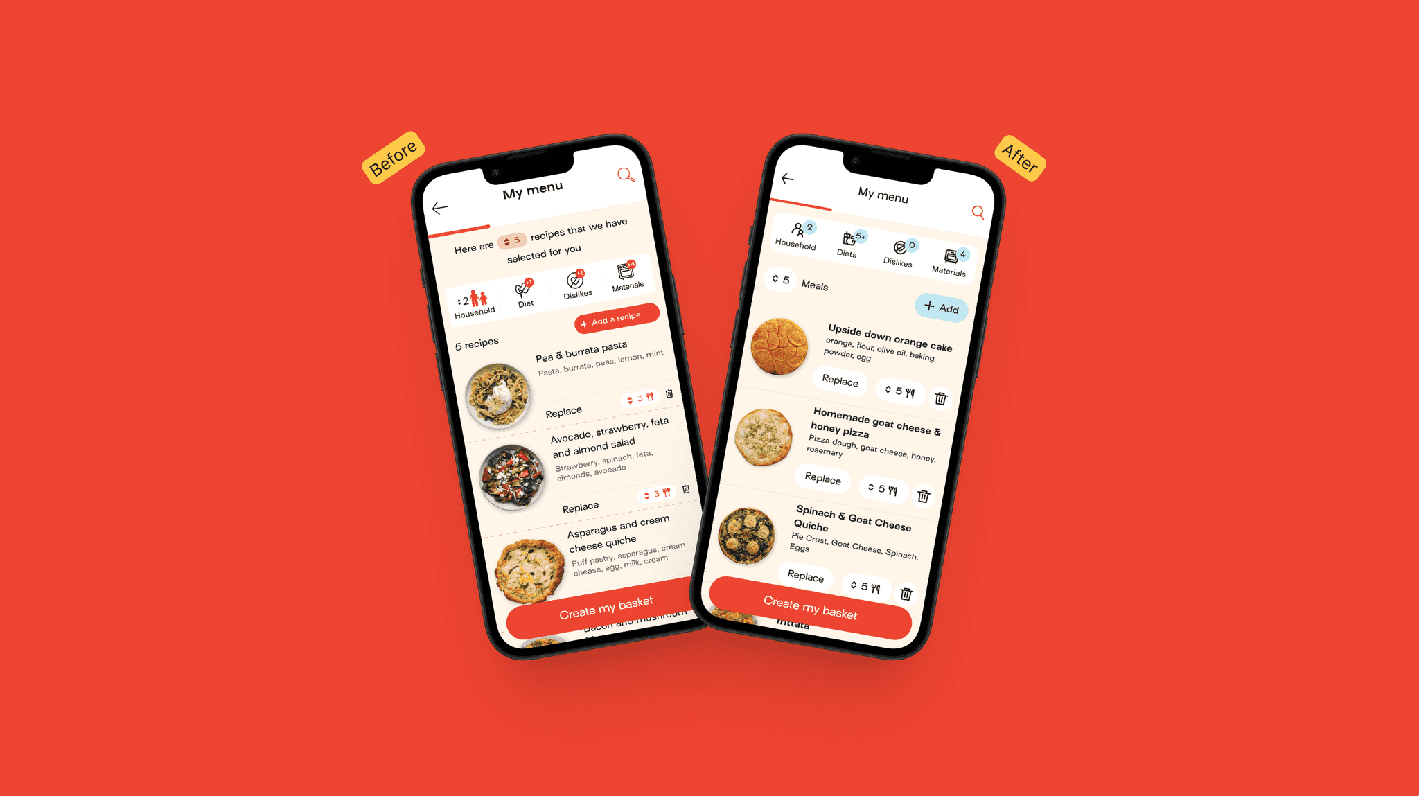
In order to introduce the changes, it was decided to revamp some key screens from the app by adding the new icons. However, in some cases, the new icons meant rethinking the interface, bringing more clarity for the end user.
Challenging at times
The 24px canvas and 2px stroke created new constraints which forced us to diverge from the way the old icons were illustrated within the existing system.
It was an interesting exercise which pushed us to simplify the interface as well as the way we would display the different concepts for each icon.
In the end we created a total of 188 icons.