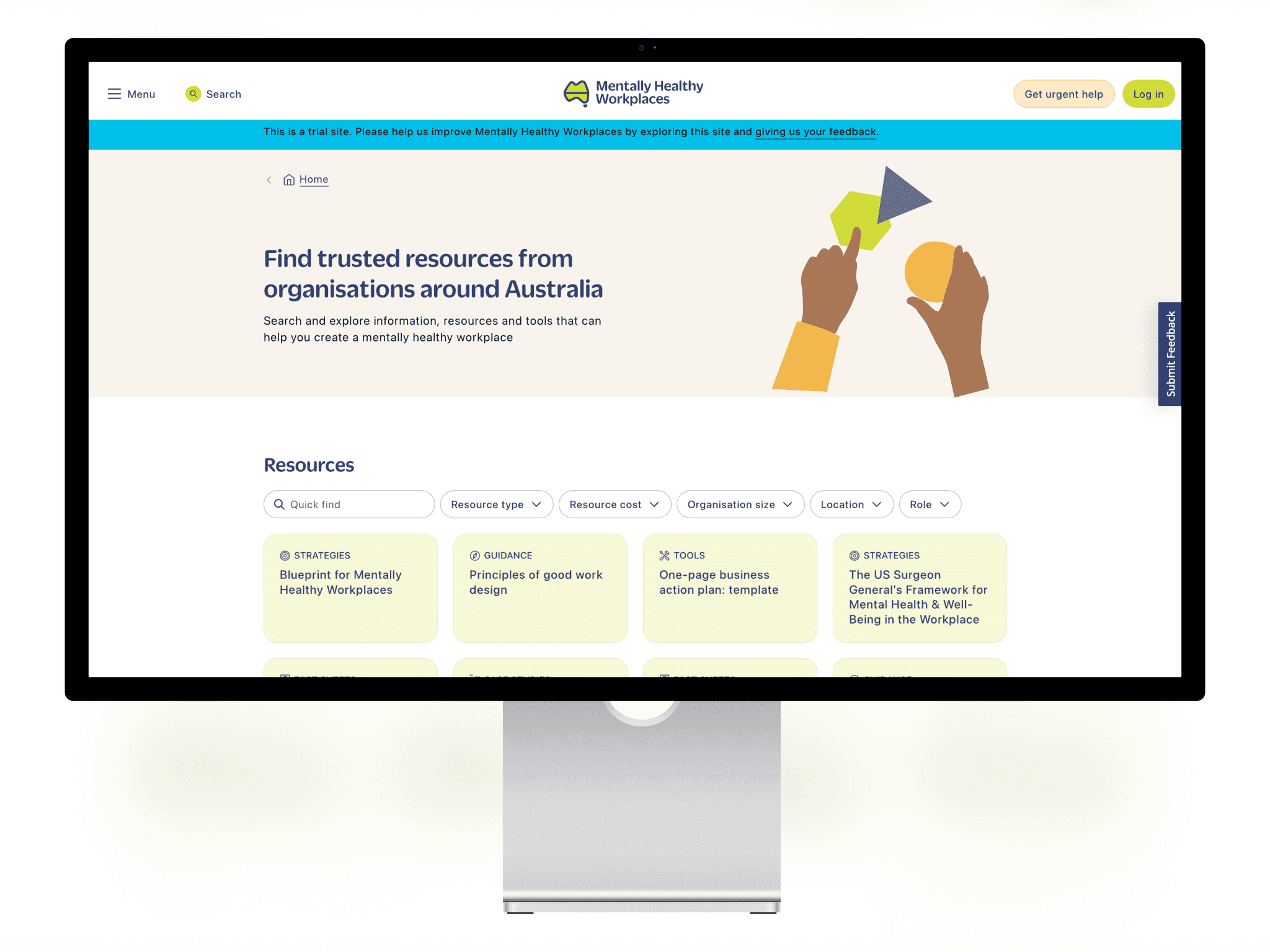
National Mental Health Commission is a website centralising all information regarding to well-being and best practices at work.
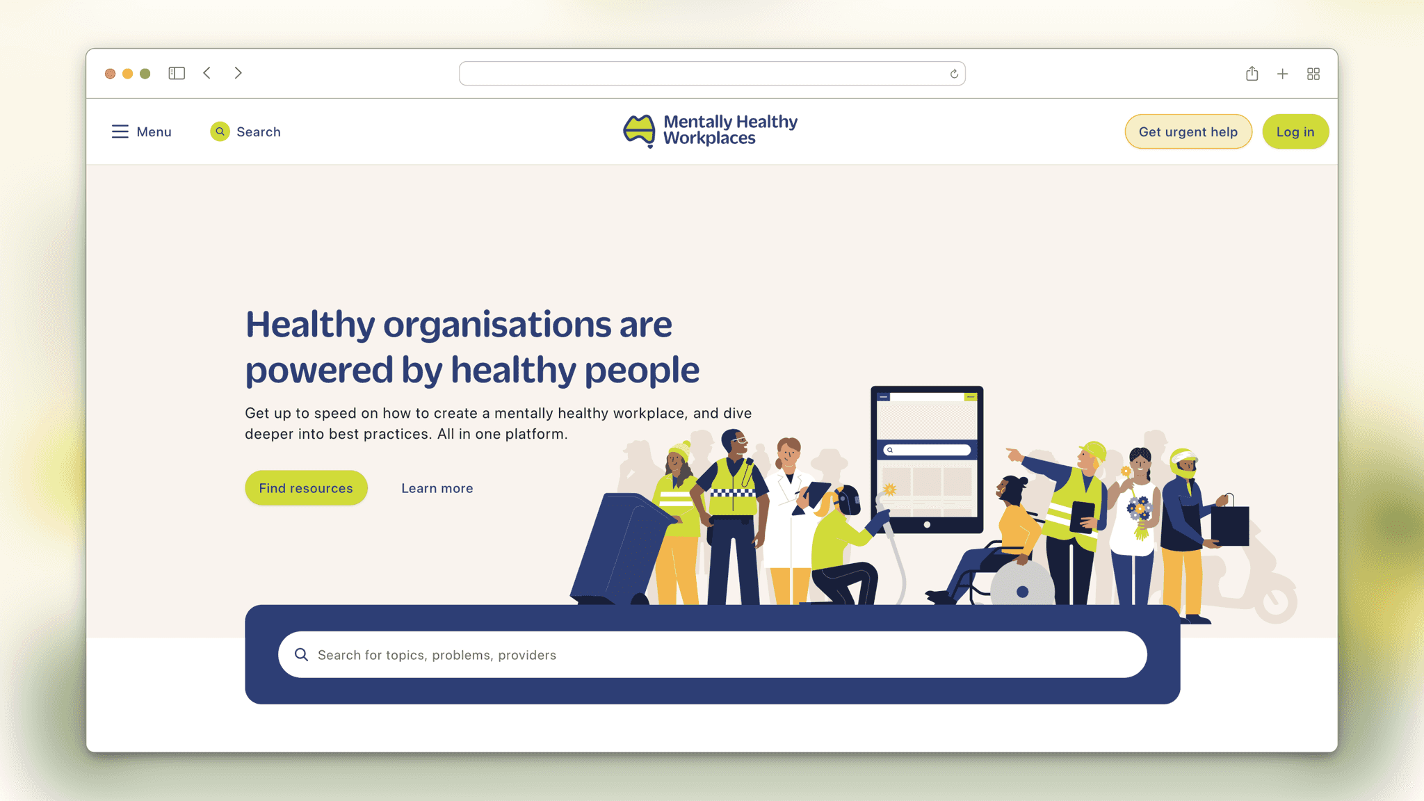
Pollen took on this project prior to my arrival and got missioned with helping the National Mental Health Commission creating a platform which would help Australian businesses improving their employees' life at work. The idea being developping a website centralising information regarding everything related to mental health.
When I joined, the foundations were well established thanks to the great work done by the team, including the designer I went to replace. However, due to code, time and project constraints, some aspects of the websites needed to be re-evaluated and changed.
Role and impact
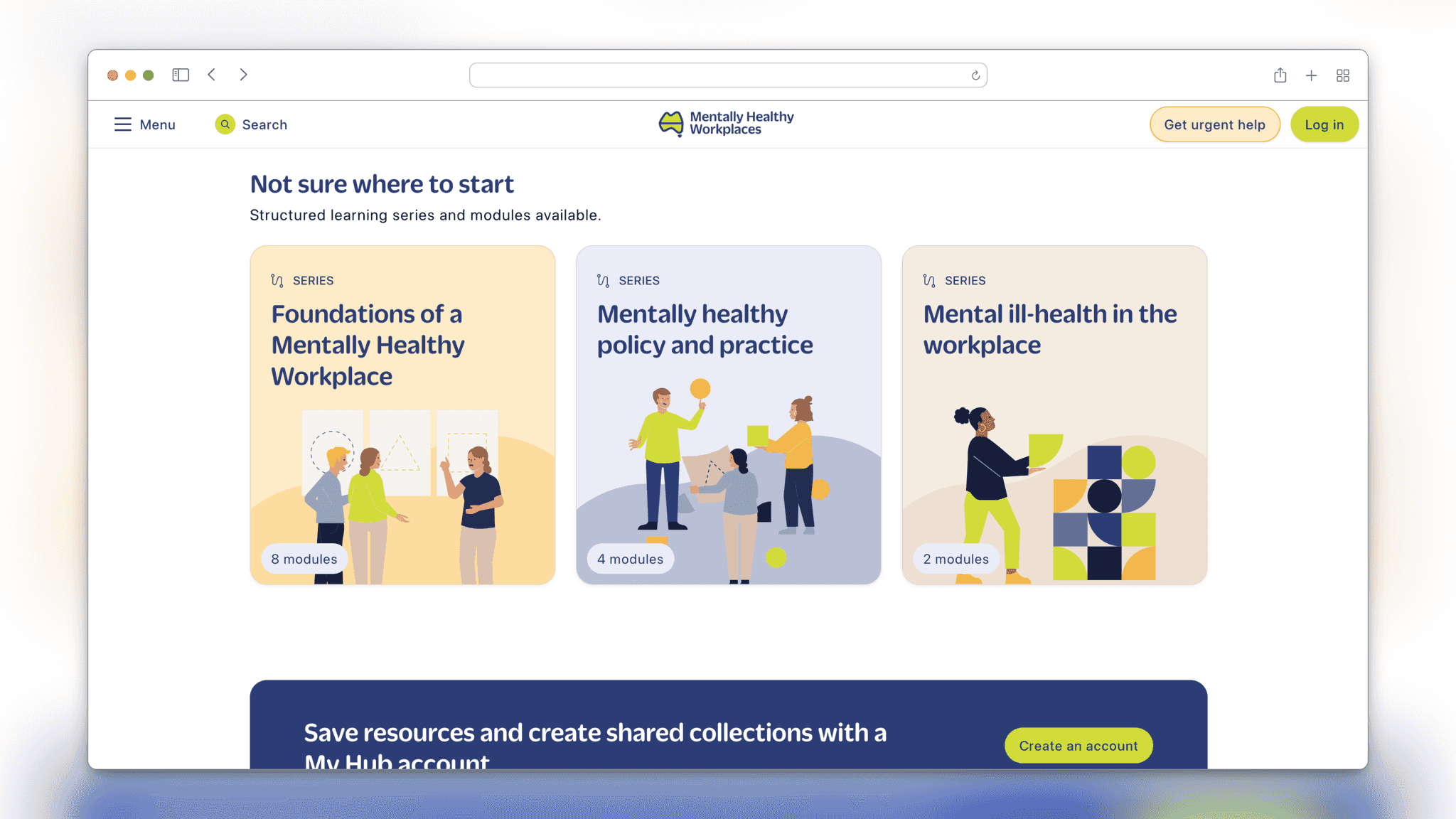
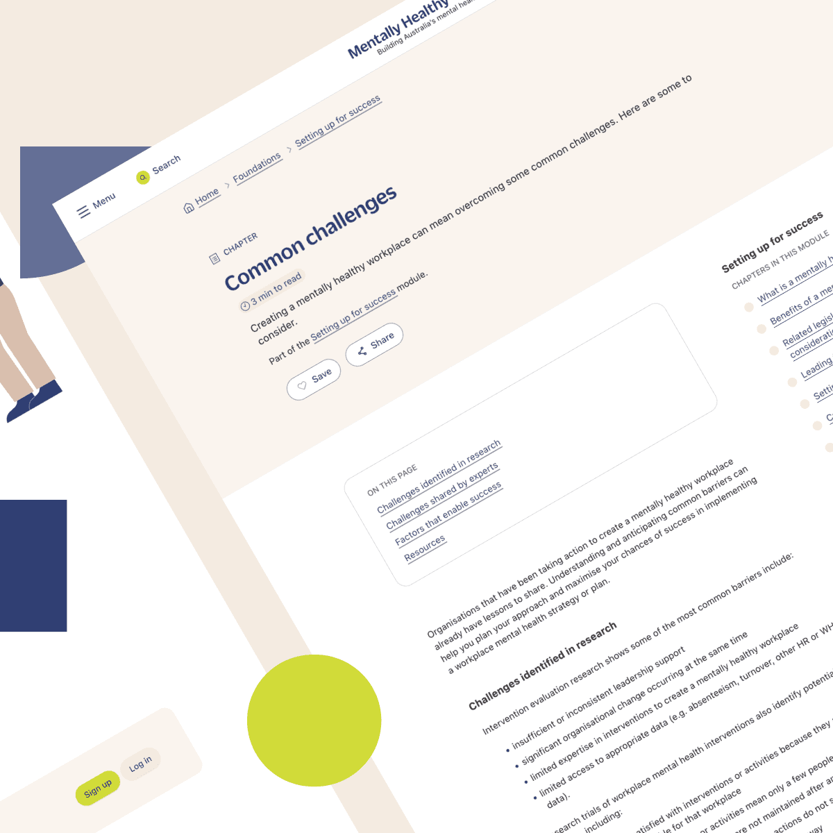
As I deep dived into the project and with the help of my colleage Ashley Rankin, I got to work on the learning modules. By thinking about the UX and some UI elements, we realised we had to create some key modules to help users having a sense of progress, as the content was very furnished.
This raised few problems as we went since the coded Design System was different from what was originally designed, and that some elements were conflicting with others. We decided to do a bit of an overall rework to address the problem at the root and prevent possible issues down the line.
Challenging the established Design System
As a newcomer in the team, I had to present my desired changes to the team in charge of the development of MHW website.
It can be sometimes difficult to amend the code and existing UI elements when jumping on something that already exists. Thanksfully, with the PreviousNext's team, we managed to find a suitable solution to solve some caveat without slowing down the rythm too much.
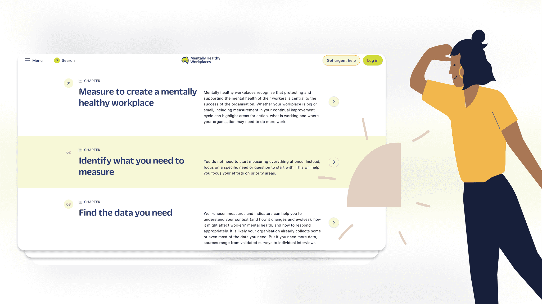
This led to a solidified Design System and allowed us to simplify the UI in order to showcase the content better.
To conclude
NMHC / MHW has been a very interesting project to me, from the cooperation with the team and stakeholders, to the subject matter itself, I am proud of what we managed to accomplish.
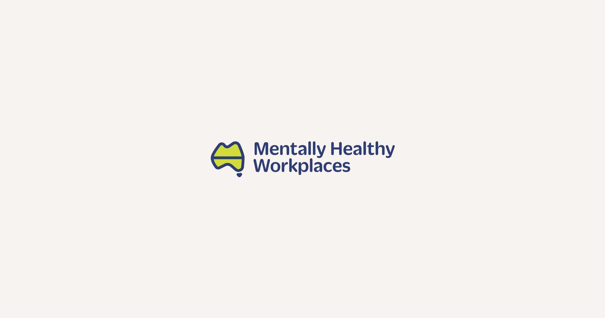
Moreover, as part of the project I got to design their logotype which is designed to use the letters M H and W to form the Australian territory.