
Jow is an app providing users with personalised recipes that can be easily ordered through their favourite grocer. The app is available in France and the USA.
With numerous upcoming features in development and the core value proposition of Jow becoming less distinct, it became imperative to address these issues and streamline the app’s structure.
Our goal was to restore clarity and enhance user experience.
At its heart, Jow was designed to enable seamless recipe ordering through any grocery store.
However, users also expressed interest in browsing culinary ideas, exploring current promotions, connecting with friends, or participating in challenges to earn rewards.
To ensure these diverse functionalities coexist harmoniously without competing for attention on the homepage, it was essential to organise them into clearly defined sections.
This restructuring aimed to preserve Jow’s simplicity and focus, guiding users effortlessly through the app’s full range of features.
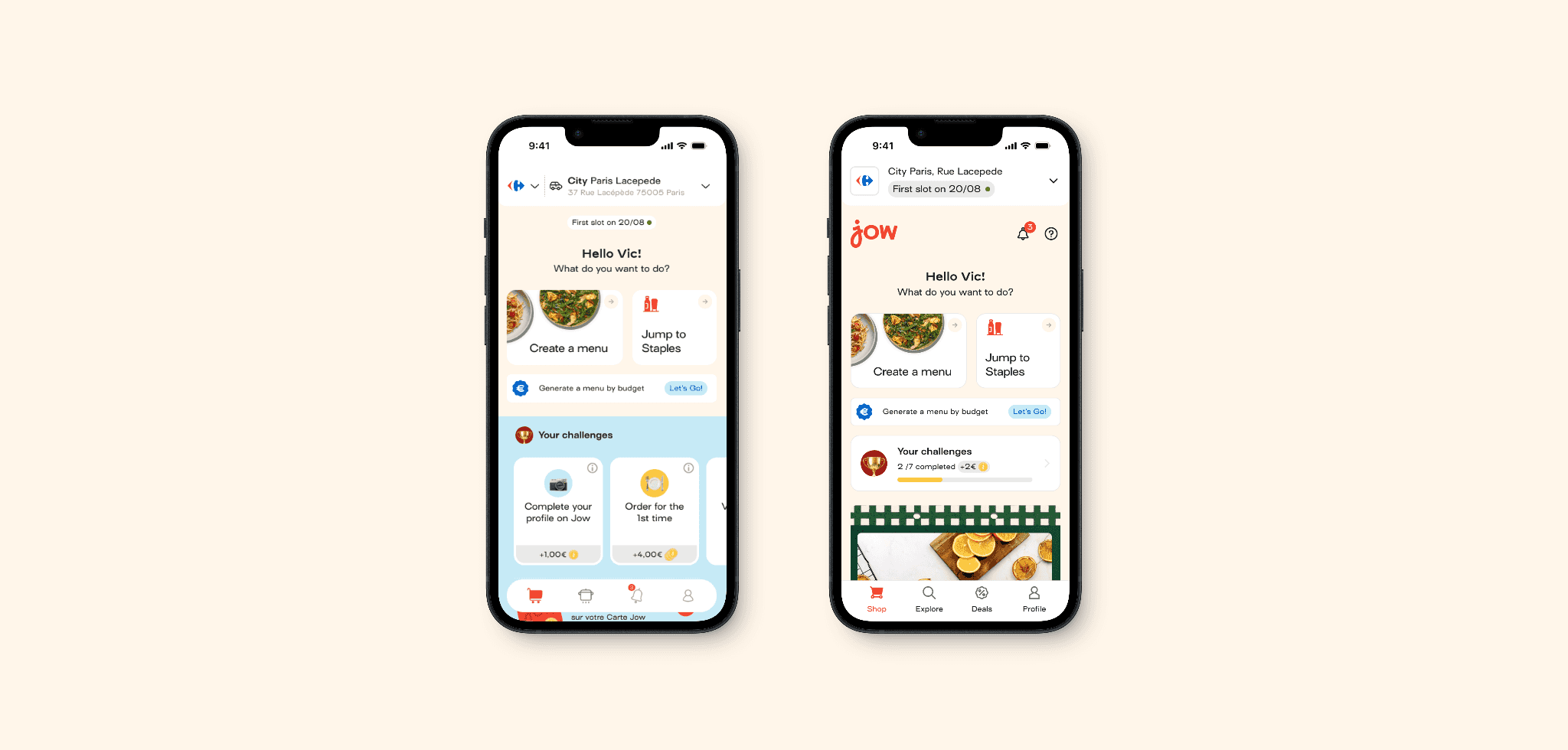
Initially, the application was structured around four primary tabs: “Shop”, “Cook”, “Notification” and “Profile”.
As the product evolved and its feature set expanded, challenges arose regarding the optimal placement and organisation of these new functionalities.
Frequently, additional features were integrated into the homepage, leading to user confusion and creating ambiguity within the team’s understanding of the navigation flow and overall information architecture.
How do we ensure a clear segmentation of the services and offering without impacting our core experience and funnel?
To address this problem, the Product Director and I collaborated to organise workshops across the company, involving members from each business unit.
Although we relied on current user feedback collected in Jira, we were unable to include actual users in the process, which might have helped prevent a future issue I will mention later.
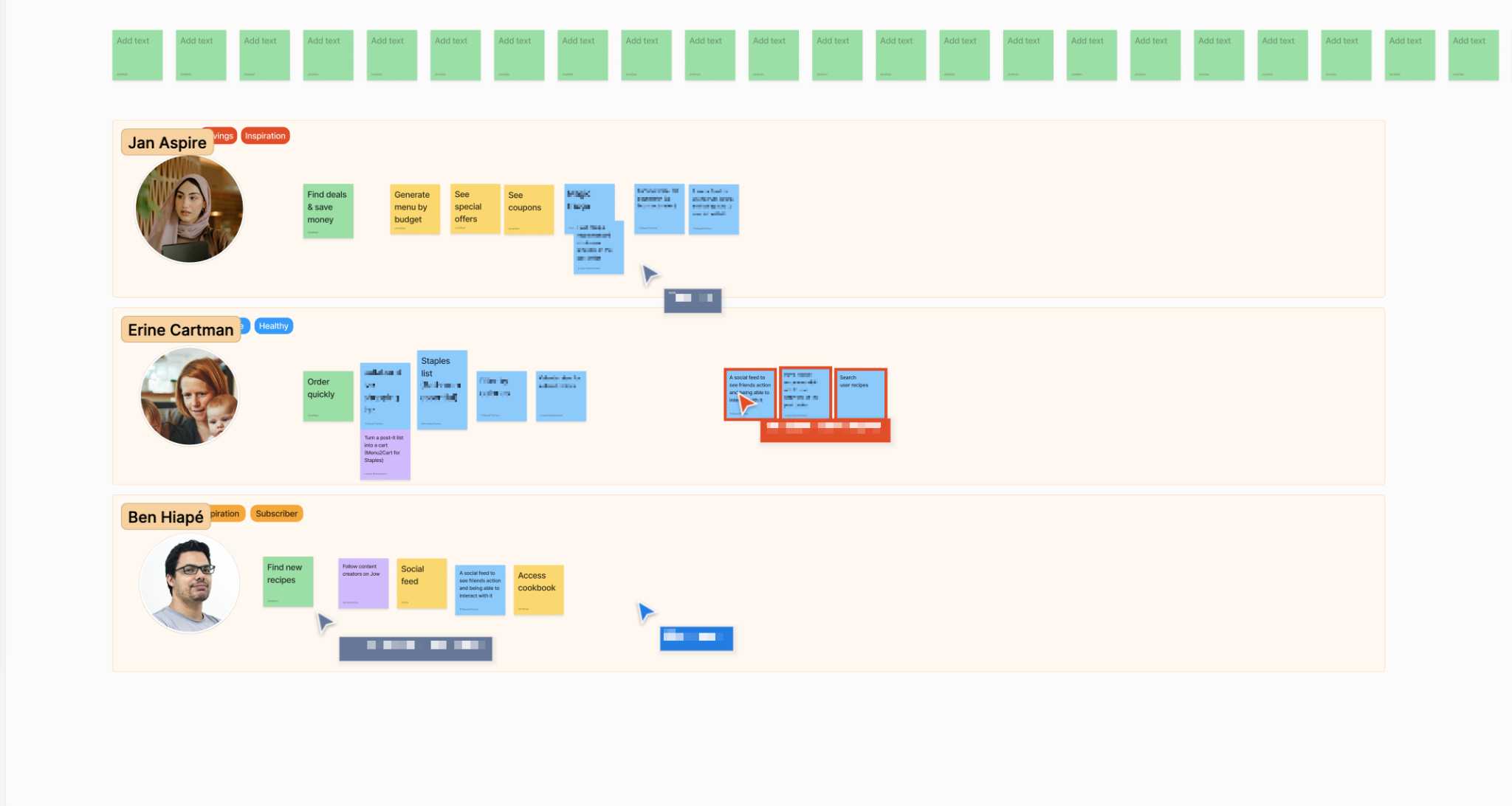
Using persona
To enable our team members to better relate to our customers, we developed three personas.
Two of these were based on a prior study conducted by an external agency, while the third was created to reflect the typical use case of our social platform users.
Discover and refocus
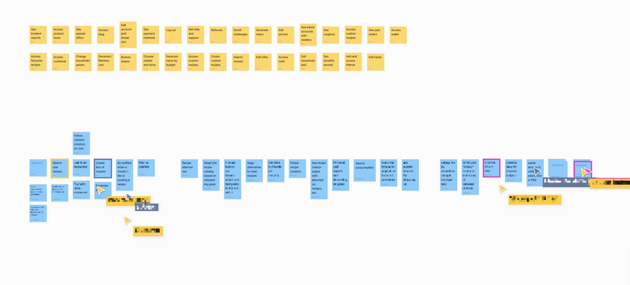
To collect everyone's ideas and input for the app's future development, we planned activities like listing all current and upcoming features and allowing the team to perform open card sorting to organise the features according to their perspectives.
Listing all features Current and upcoming ones in order to plan ahead for the better.
Open card sorting To group features so we can dispatch them in different sections.
Prioritisation & known issues Based on the defined Persona, we organised the features by importance, then we wrote down some known issues to see how we could solve them.
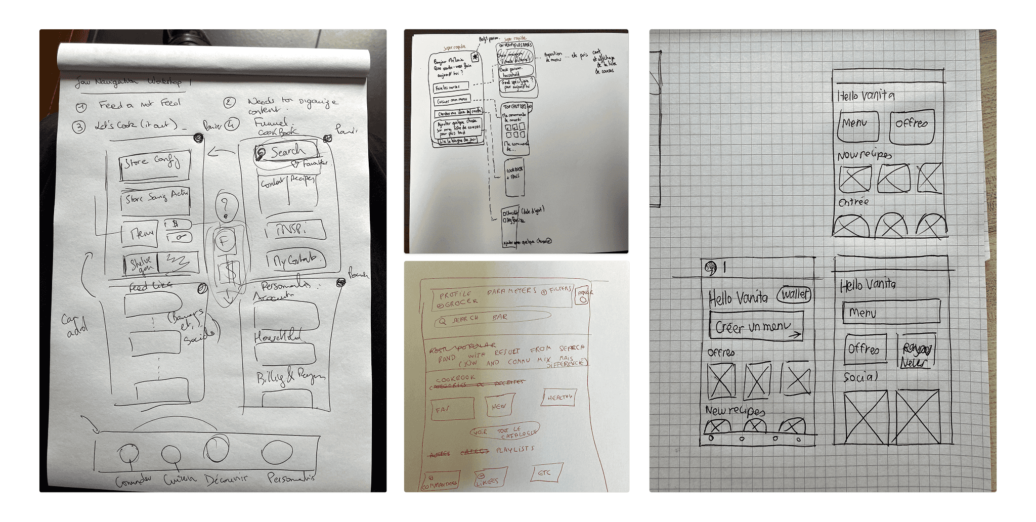
Sketching
We requested the nine interviewees to illustrate their ideal core page and experience. Thanks to the earlier exercises, each participant was able to offer thoughtful explanations, which aided in shaping the direction of our new information architecture.
The result
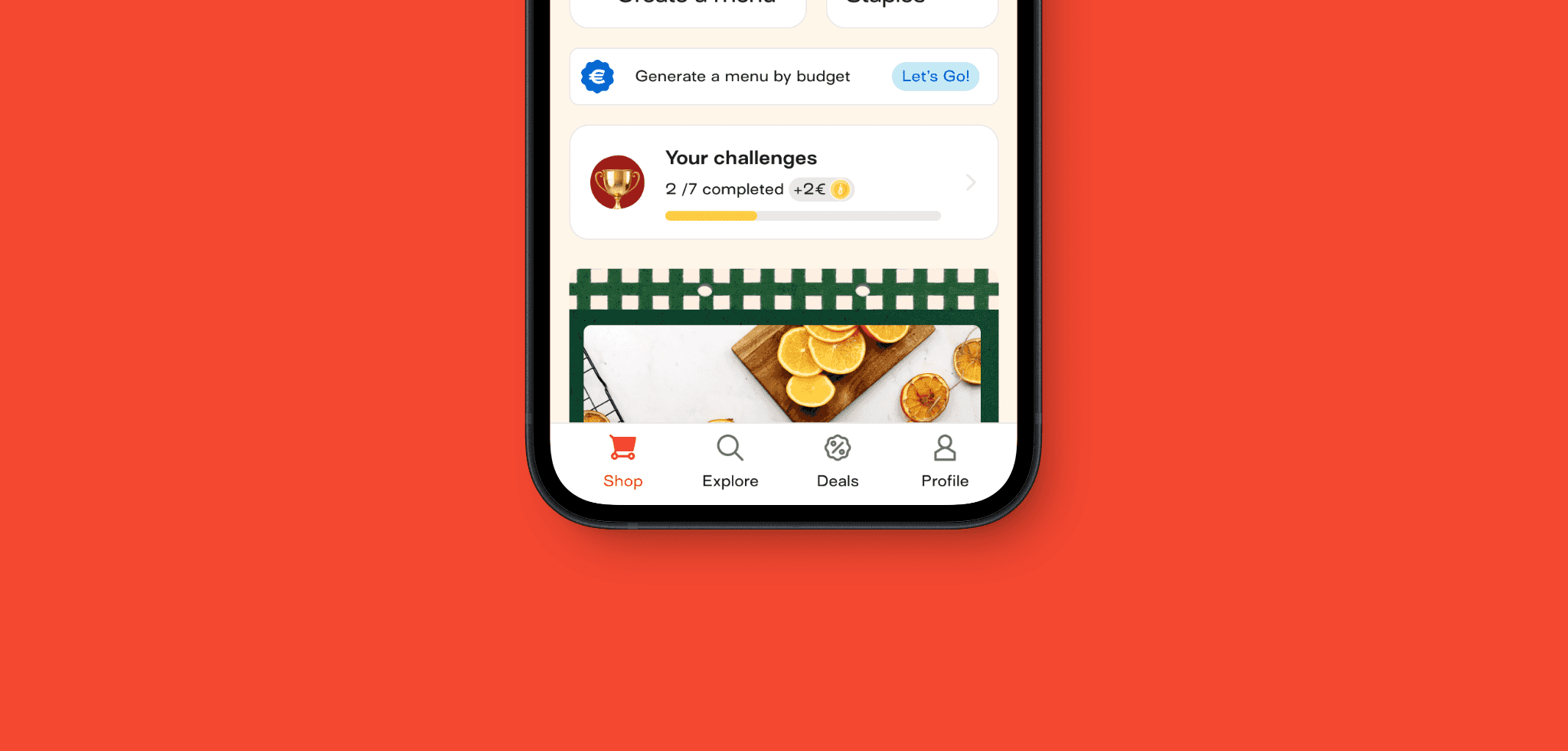
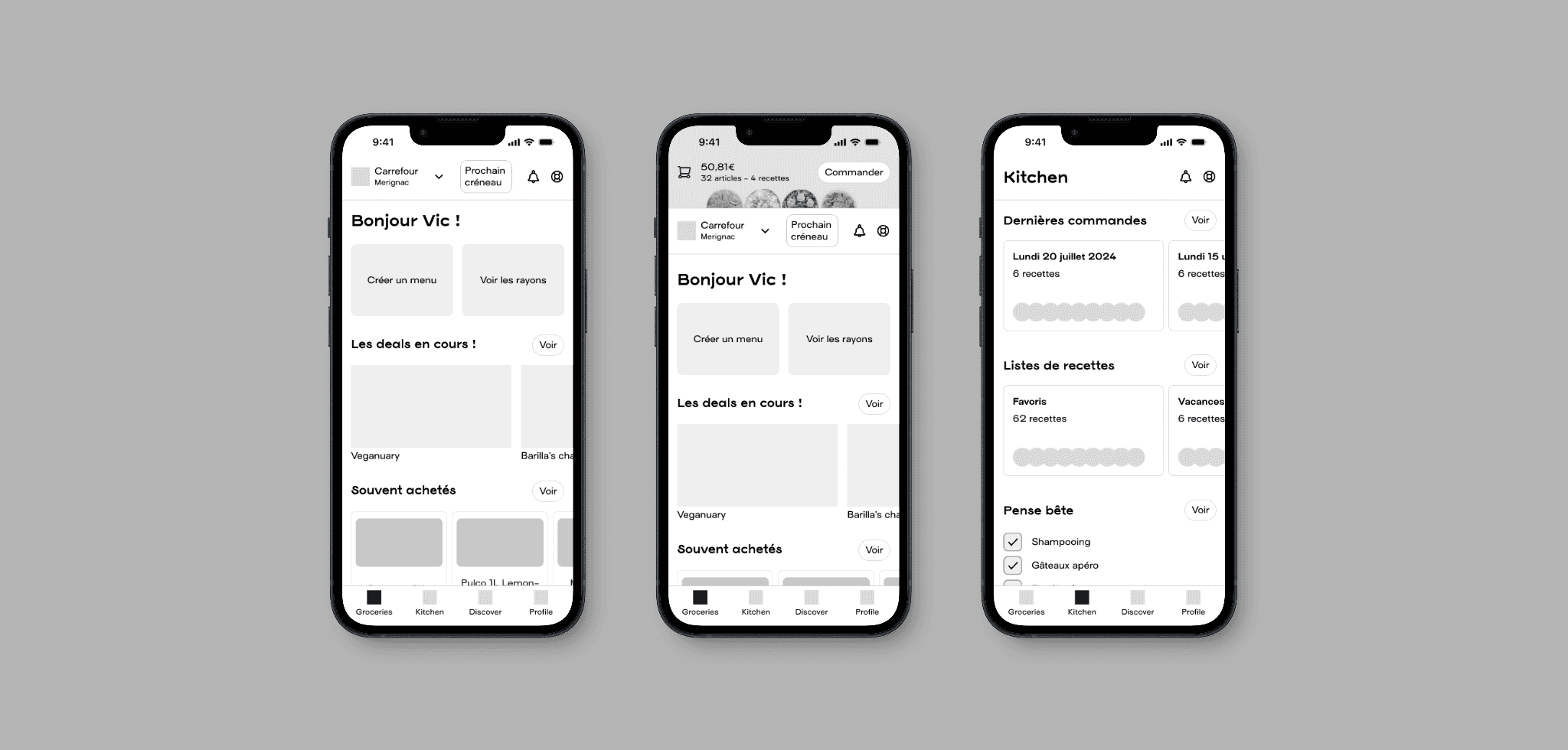
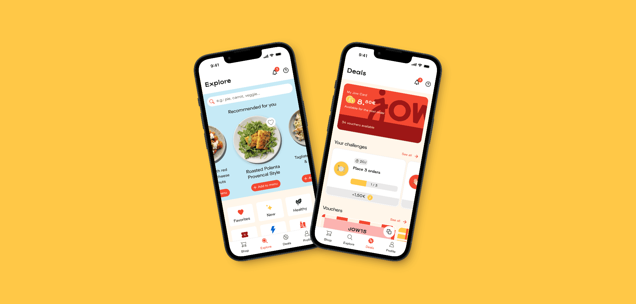
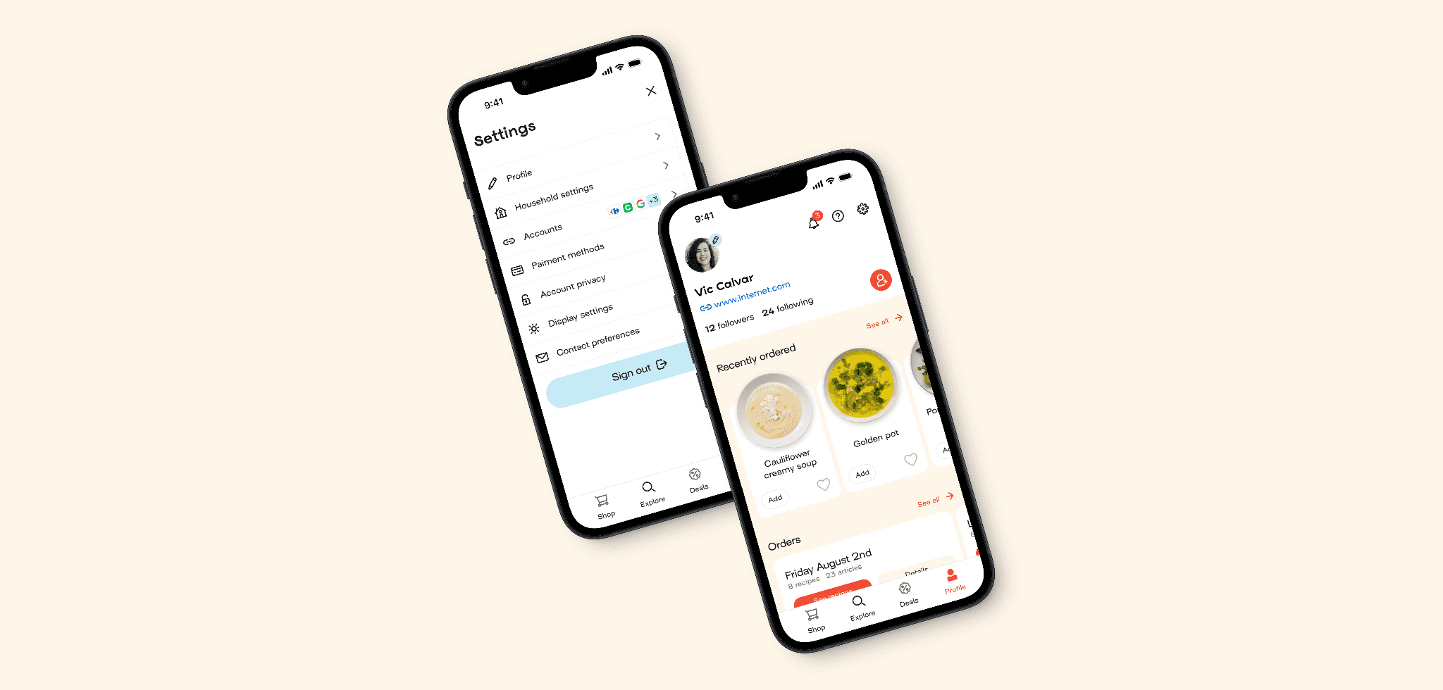
After further refinement, we retained four tabs, including quick access to notifications and the help center to meet the key need for assistance.
The first tab is dedicated to the shopping experience.
The second tab provides access to the complete recipe catalog, which was previously difficult to find.
A new tab was created for all money-saving features.
The final, most complex tab is the profile section, where users can view their purchased recipes and order history.
Quick iterations
As previously noted, we should have involved users earlier, at least prior to full deployment.
However, due to time pressures from other projects, we rushed the release of the new navigation, which led to some negative feedback from our users.
Fortunately, thanks to the team's prompt response, we were able to swiftly incorporate their feedback and develop a robust new method for presenting information throughout the application.
Future proof
Although this exercise was sometimes difficult, it proved to be very rewarding when brainstorming new features and determining their placement within the app.
The team embraced the new structure and leveraged it to explore additional opportunities, like a social feed and more.